In the volatile world we live in, fully reading a website is also out of date. Visitors want information quickly and clearly. All the more reason to make sure your website is fast and clear!
In this article, I'll tell you how most websites are read, and how you can capitalise on that.
Scanning, so clear headings
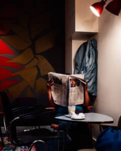
You don't quite read the newspaper either, at least not me. Fleetingly, we flip through the newspaper, looking for that headline that appeals to us. You have those headlines on your website too!
By using the so-called H2 and H3 headings, you divide your page into bite-sized chunks. You use the
tag for the most important headings in your text, the only if those headings need further subdivision.
Note: I still recommend using only 1 H1; for the page title (the all-important heading).
Make it attractive to read on
So not just endless texts. Also consider variety through relevant illustrations and professional videos to be used.
If a page consists only of text, I drop out at some point, or start scanning even more globally. Then I might miss your message. Also, quotes always stand out nicely and break up long pieces of text.
"A newspaper is a lending library with high blood pressure."
- Arthur Baer
This is why so many people read the Telegraph on holiday alone.
Chew out the desired action
Your visitor doesn't want to think, they want to find. Prefer to post on your website the answer to his/her question. And when that answer is found, he/she would prefer to send you a message immediately, buy your product or subscribe to your newsletter, because you share such useful things.
That visitor, you can direct them in many ways. You can do it on one page, but you can also do it through other pages. On each page, you need to determine what the main goal (your so-called "call to action") is and then send the visitor to that goal as quickly as possible. As quickly as possible, because sometimes it takes up to 2,000 words of text before someone gets there.
That desired action can be emphasised in several ways, just read, for example, the classic Don't make me think by Steve Krug (I don't get paid to recommend those, or when you buy that book). The most famous is the eye-catching button. Put it in the right way so your visitor can't scan around it!
Conclusion: your visitor reads your website first and foremost not
Heartburn, of course. All that effort put into beautiful texts, perhaps a copywriter hired, and then that visitor doesn't even read your texts.
Of course, this is only partly true. I also said at the beginning of the article that the visitor will no longer visit your website complete reads. As a visitor scans your page, he passes all the relevant information. And if a heading appeals to him/her, the text underneath will be read.
If you have fine images and videos, the information around those images will really be included. What goes by in the videos ties in with your text and is therefore also reinforcing.
Along all the information runs the path to your call to action, the final goal of a page.
So make sure your website is full of relevant information anyway. Then that visitor will come naturally!