You don't think about it every day, but every colour on your website has a meaning. Subconsciously, we associate a colour with a feeling, with an emotion. In this website, you will find the colour yellow as a supporting colour to the predominantly black and white. Yellow is a colour associated with something positive (besides Easter, of course, but that's a whole other story).
When I analyse a website, I mainly look at wrong use of colours. Is that possible? Yes indeed. For instance, red quickly makes us think of an error message, and green is that fine colour that accompanies a successfully submitted form.
It's not set in stone. But check the notifications on your website during and after a form is submitted. Chances are they are roughly in these colours:
.information {colour: #00529B;background-color: #BDE5F8;}
.success {colour: #4F8A10;background-color: #DFF2BF;}
.error message {colour: #D8000C;background-color: #FFBABA;}
.warning {colour: #D63301;background-color: #FFCCBA;}
Actually quite logical, right? Just think of a traffic light. They are the colours we are used to. They work that way on your website too. If, to emphasise a text, you turn a sentence red, it will trigger a reaction. Your brain sees an error message. So red (and shades of red) as a text colour is something you want to avoid.
Positive and negative associations with colours
Let it be clear that a colour can have both positive and negative associations. I mentioned positivity as an association with yellow, but you might also recognise the overexcitement (nervousness) association. Both Zwitsal and I chose to gamble on the positive association.
Overview of colour meanings
Blue
Positive: Trust, loyalty
Negative: Conservative, businesslike
Where do we see blue?
Visa, Dell, Facebook, central government
Light blue
Positive: Young, cool
Negative: Cold, emotionless
Where do we see light blue?
Skype, Twitter, AH, United Nations
Brown
Positive: Safety, warmth
Negative: Boring, stubborn
Where do we see brown?
M&Ms, UPS, Nespresso, Louis Vuitton
Yellow
Positive: positivity, renewal
Negative: anxiety, overstimulation
Where do we see yellow?
McDonalds, Lay's, Snapchat, Ferrari
Grey
Positive: Neutral, timeless
Negative: Unspoken, boring
Where do we see grey?
Apple, Toyota, Mercedes-Benz, WordPress
Green
Positive: Balance, growth
Negative: Boredom, jealousy
Where do we see green?
Land Rover, Forestry Commission, Spotify, BP
Orange
Positive: Optimistic, warm
Negative: Immature, cheap
Where do we see orange?
Fanta, PostNL, Nickelodeon, Amazon
Purple
Positives: Quality/luxury, creativity
Negative: Decadent, introversion
Where do we see purple?
Milka, Monster.com, Lucardi, Hallmark
Red
Positive: Passion, active
Negative: Aggression, provocation
Where do we see red?
Coca-Cola, Levi's, Texaco, Netflix
Pink
Positive: Calming, caring
Negative: Helpless, inhibition
Where do we see pink?
Dunkin' Donuts, Lyft, LG, T-Mobile
White
Positive: Perfection, clarity
Negative: Indifferent, sterile
Where do we see white?
Apple, Swarovski, Uber, Mini
Black
Positive: Soundness/efficiency, glamour
Negative: Aloof, threatening
Where do we see black?
New York Times, WWF, Audi, Nike
In many cases, of course, it is a combination of two or three colours, but usually one predominates. Do you understand why the companies above chose those particular colours in their logo?
Sometimes you have to "think around". You can consciously choose cheap (orange) and or the overpricing of yellow. That Jumbo commercial with Snollebollekes? Right. Rabobank uses blue and orange. Wibra has a yellow/red logo, as does Lay's. Sometimes certain combinations are chosen precisely for the combination of positive and negative attributes.
Complementary colours
Colour psychology can sometimes go far. You choose your house style colours based on what you want to radiate. You go for recognition. That sometimes makes you dependent too. You can read here how companies did or did not change their logo and sometimes colours (and sometimes changed back). In most cases, the colours still provide recognition even if the logo changed completely (see BP, Converse).
On a website I look always to colour use. One of the most common mistakes is taking the house style too far. It's nice that green is your house style colour, but if you make everything green, nothing stands out. Especially your call-to-action, the action on the page that you hope people will do (e.g. click on a button), should stand out.
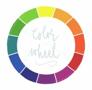
One way to do that is to use a complementary colour for that button. Then you can be sure the button will stand out!

Download
Complementary colours can be found in the colour wheel. The colours that are opposite each other are complementary. So if you have a predominantly blue website, an orange button will stand out the most. Yellow is opposite purple.
Just a side note: It doesn't have to be so black and white, of course. Your own opinion and preference counts too.
I definitely wanted dark yellow, but definitely not purple. In the colour wheel, blue sits opposite those transition colours from yellow to orange, and I chose to use blue for the first button on my homepage. They are guidelines, not laws.
A very important note here is that complementary colours are together, are not necessarily a good combination. If you use one colour as a background, and the other as a text colour, unreadable text may result:
Perhaps this
not the best idea
as you can see!
Doing it now: check out your website!
The main lesson is that it's okay to be critical:
- The look and feel of your logo and corporate identity. Do the colours match the image you hope to have or achieve?
- The various call-to-actions on your website. Do they stand out enough? By using a complementary colour, can you make the most important elements on your site stand out even more?
I would just do it.
Sources:
linku.co.uk/colour-psychology
colourharmony.co.uk/colour-and-significance
colour-affects.co.uk/psychological-properties-of-colours
Handy:
Colour picker
Colour generator